To add X-axis values in Excel, right-click the chart, choose Select Data, select Edit under Horizontal (Category) Axis Labels, and pick the cells that hold your labels.
This guide covers new and existing charts, typed custom labels, scatter charts with numeric X values, ranges that grow on their own, and fixes for labels that come out wrong.
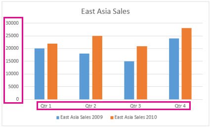
The fastest way to add X-axis values to an existing chart
Use this when the chart already exists but its horizontal axis shows 1, 2, 3 or the wrong text. It works in Excel for Microsoft 365, Excel 2024, 2021, 2019 and 2016 on Windows.
- Type your X-axis values in one column or row next to the chart data, one value per data point.
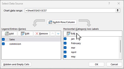
- Right-click the chart and choose Select Data.
- Under Horizontal (Category) Axis Labels, select Edit.
- Click in the Axis label range box, then drag across the cells that hold your values.
- Select OK, then OK again to close Select Data Source.
The axis now reads from those cells. Edit a cell later and the chart label changes with it.
Which method should you use?
| Your situation | Use this | Why |
|---|---|---|
| Labels already sit in the worksheet | Select Data > Edit > Axis label range | Labels stay linked to the cells |
| You want chart labels that differ from the sheet | Type labels separated by commas in Axis label range | Sheet data stays untouched |
| Your X values are numbers at uneven gaps | Scatter (X, Y) chart | Its horizontal axis is a value axis, not categories |
| Your X values are dates | Line, column, bar or area chart with a date axis | Excel spaces dates on a time scale |
| Excel put your labels on the wrong axis | Chart Design > Switch Row/Column | Swaps which data sits on the horizontal axis |
| New rows keep arriving | Named range with OFFSET | The axis grows without re-selecting data |
Prerequisites for Adding X-Axis Values
| You need | Details |
|---|---|
| A chart type with a horizontal axis | Pie and doughnut charts have no axes, and radar charts have no horizontal (category) axis. |
| One label per data point | Put the labels in a single column or row, in the same order as the values. |
| Excel desktop for typed custom labels | Microsoft notes that typing labels independent of the worksheet works only in Excel, not in Word, PowerPoint or Outlook charts. |
| An unprotected sheet for drop-downs | Data Validation is unavailable when the worksheet is protected or shared. |
Understanding the Importance of X-Axis Values in Excel
Excel uses two kinds of horizontal axis, and the kind decides what your X values can do. Pick the chart type with this in mind before you add labels.
| Axis type | Charts that use it | What X values do |
|---|---|---|
| Text (category) axis | Column, bar, line, area | Shows labels at even spacing, whatever the values are |
| Date axis | Line, column, bar, area, stock | Plots dates in time order at a base unit of days, months or years |
| Value axis | Scatter (X, Y), bubble | Places points by their numeric X value, with full scale options |
| No horizontal axis | Pie, doughnut, radar | X-axis values cannot be added |
Without real X values, a line chart numbers its categories 1, 2, 3 on its own. That is the usual reason readers go looking for this fix.
Step-by-Step Guide to Adding X-Axis Values
Follow this order when you build the chart from scratch. Each step matches one stage: prepare your data, insert a chart, open the axis options, set the values, use Select Data Source, then finalize.
- Prepare your data: put the X-axis labels in the first column and each data series in the columns to its right, with a header row on top.
- Insert a chart: select the whole range, open the Insert tab and pick a column, line or bar chart.
- Access horizontal (X) axis options: right-click the horizontal axis and choose Format Axis to open the Format Axis pane.
- Set specific X-axis values: in the Format Axis pane, expand Axis Options and, under Axis Type, choose Text axis or Date axis to suit your values.
- Use the Select Data Source option: right-click the chart, choose Select Data, select Edit under Horizontal (Category) Axis Labels, and confirm the Axis label range points at your label cells.
- Finalize your chart: on the Chart Design tab, select Add Chart Element > Axis Titles > Primary Horizontal, then type a title for the axis.
An axis title is not an axis label. The title names the axis, while the labels are the values along it.
Customizing X-Axis Labels in Excel
Typed labels replace the chart text without changing a single cell. Use them when the sheet holds codes or dates but the chart needs plain names.
- Right-click the category labels on the chart and choose Select Data.
- In the Horizontal (Category) Axis Labels box, select Edit.
- In the Axis label range box, delete the cell reference.
- Type the labels separated by commas, for example
Quarter 1,Quarter 2,Quarter 3,Quarter 4. - Select OK twice.
Typed labels are no longer linked to worksheet cells, so later edits in the sheet will not reach them.
Two additional tips: to change label fonts, right-click the axis labels and select Font. To angle long labels, open Format Axis, select Text Options, and set Custom angle under Text Box.
Handling Multiple Data Series When Adding X-Axis Values in Excel
Column, line and bar charts share one set of category labels across every series. A scatter chart lets each series carry its own X values.
- Prepare your data: keep one label column on the left and one column per series beside it, all the same length.
- Insert your chart: select the full block, including headers, and insert the chart from the Insert tab.
- Assign X-axis values: right-click the chart, choose Select Data, select Edit under Horizontal (Category) Axis Labels, and select the label column once for all series.
- To change one series instead, select it in Legend Entries (Series), select Edit, change its ranges and select OK.
- Use the scatter plot for precise X-axis control: place X values in the first column and Y values in the next, then select Insert > Insert Scatter (X, Y) or Bubble Chart.
- For a second scatter series with different X values, open Select Data, select Add, and point the new series at its own X range and Y range.
Use Move Up and Move Down in Select Data Source to reorder series. Removing a series deletes it, and chart filters cannot bring it back.
Create a Named Range for Dynamic Data
A named range built with OFFSET grows as you type new rows, so the X-axis never needs re-selecting. The example assumes months in column A and sales in column B, with headers in row 1.
- On the Formulas tab, select Define Name in the Defined Names group.
- In the Name box, type
Date. - In the Refers to box, type
=OFFSET($A$2,0,0,COUNTA($A:$A)-1)and select OK. - Select Define Name again and type
Salesin the Name box. - In the Refers to box, type
=OFFSET($B$2,0,0,COUNTA($B:$B)-1)and select OK.
COUNTA counts every filled cell in the column, so keep other entries out of columns A and B below the data.
Use the Named Range in Your Chart
- Select the data, open the Insert tab and choose a chart type.
- Right-click the chart and choose Select Data.
- Under Legend Entries (Series), select Edit, type
=Sheet1!Salesin the Series values box and select OK. - Under Horizontal (Category) Axis Labels, select Edit.
- In the Axis label range box, type
=Sheet1!Dateand select OK.
Replace Sheet1 with your sheet's name. Add a month and a value in the next row, and both appear on the chart.
Implement Dynamic Axes with Data Validation
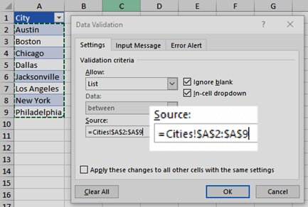
A drop-down list can set how many X-axis values the chart shows. The list feeds a cell, and the named range reads its height from that cell.
- Type the choices, such as
3,6and12, in a spare range, for exampleH2:H4. - Select the cell that will hold the choice, for example
E1. - Go to the Data tab and select Data Validation.
- On the Settings tab, set Allow to List, select the Source box, select
H2:H4, and select OK. - Edit the
Datename so its Refers to box reads=OFFSET($A$2,0,0,$E$1). - Edit the
Salesname the same way, using=OFFSET($B$2,0,0,$E$1), then pick a value inE1.
Keep the choices in the list no larger than the number of filled data rows, or the chart picks up blank cells.
Best Practices for X-Axis Management
These settings live in the Format Axis pane. Right-click the horizontal axis and choose Format Axis to open it.
| What you want | Setting | Where |
|---|---|---|
| Show every label, not every other one | Interval between labels > Specify interval unit = 1 | Labels |
| Thin out crowded labels | Specify interval unit = 2 or 3 | Labels |
| Group dates by month or year | Axis Type = Date axis, Units > Base | Axis Options |
| Reverse the category order | Categories in reverse order | Axis Options |
| Move labels away from the axis line | Distance from axis | Labels |
| Fewer tick marks | Interval between tick marks | Tick Marks |
| Numbers as currency or percent | Number > Category | Number (value axes) |
Keep labels linked to cells rather than typed, so a fix in the sheet fixes the chart too.
Refresh Charts After Data Changes
A chart linked to cells updates the moment those cells change. Use these checks to confirm the new X-axis values took hold.
- Change the text in one label cell and press Enter; the matching chart label should change at once.
- Select the chart and look at the worksheet; the source range shows sizing handles around the cells it uses.
- If a new row sits outside that outline, drag the sizing handles to include it.
- Right-click the chart, choose Select Data, and confirm the Horizontal (Category) Axis Labels list shows your values, not 1, 2, 3.
Typed labels and labels on a chart sheet do not follow the worksheet. Re-open Select Data to update those.
Common Issues and Troubleshooting When Adding X-Axis Values in Excel
Incorrect data range selected
The Axis label range includes the header, misses a row, or points at the values column.
- Right-click the chart and choose Select Data.
- Under Horizontal (Category) Axis Labels, select Edit.
- Reselect only the label cells, without the header, and select OK.
Using a chart type that doesn't support a custom X-axis
Pie and doughnut charts have no axes, and radar charts have no horizontal axis.
- Select the source data again, including the headers.
- On the Insert tab, pick a column, line, bar or scatter chart.
- Delete the old chart, then add the X-axis labels to the new one.
Axis labels not updating after data change
The labels were typed into Axis label range, or the new rows fall outside the chart's source range.
- Open Select Data and check whether Axis label range holds a cell reference or typed text.
- Replace typed text with a cell range so the labels follow the sheet.
- For growing data, switch to the
DateandSalesnamed ranges shown above.
Data not properly structured
Labels and values are in mismatched orientations, so Excel plots rows where columns were intended.
- Select the chart.
- On the Chart Design tab, in the Data group, select Switch Row/Column.
- If labels are still wrong, rearrange the sheet so labels sit in the first column or row.
Only some X-axis values show, or values are skipped
Excel spaces labels out when they crowd the axis.
- Right-click the horizontal axis and choose Format Axis.
- Expand Labels and choose Specify interval unit.
- Type
1to show a label for every category.
Numeric X values plot as evenly spaced labels
Line and column charts treat X values as categories, not numbers.
- Arrange the data with X values in the first column and Y values in the next.
- Select both columns and choose Insert > Insert Scatter (X, Y) or Bubble Chart so the horizontal axis becomes a value axis.
Frequently Asked Questions
How do I add X-axis values in Excel?
Right-click the chart, choose Select Data, and select Edit under Horizontal (Category) Axis Labels. Select the cells that hold your values in the Axis label range box, then select OK twice. The axis now reads from those cells.
How do I change the X-axis values in Excel?
Edit the label cells in the worksheet and the chart updates at once. To change the range itself, open Select Data, select Edit under Horizontal (Category) Axis Labels, and pick a new range in the Axis label range box.
How do I add more values on the X-axis in Excel?
Add rows to the source data, then select the chart and drag the sizing handles around the source range to include them. If labels are skipped rather than missing, open Format Axis, expand Labels, and set Specify interval unit to 1.
How do I make an X-axis in Excel if the chart has none?
Select the chart, open the Chart Design tab, and select Add Chart Element, then Axes, then Primary Horizontal. Pie and doughnut charts cannot show an axis, so change the chart type first if you use one of those.
How do I choose which data goes on the X-axis in Excel?
Put the data you want on the X-axis in the first column of your range before you insert the chart. If Excel still places it on the wrong axis, select the chart and choose Switch Row/Column on the Chart Design tab.
How do I set axis values in Excel to a fixed range?
Fixed minimum and maximum bounds apply to value axes, such as the vertical axis or a scatter chart's horizontal axis. Right-click the axis, choose Format Axis, and set the scale under Axis Options. Text category axes offer interval and order settings instead.
How do I increase the X-axis in Excel?
For a category axis, add more labels and data rows, then extend the source range. For a scatter chart, right-click the horizontal axis, choose Format Axis, and widen its scale under Axis Options. A date axis can switch its base unit to months or years.
How do I add another axis to an Excel chart?
Select a data series, open Format Data Series, and choose Secondary Axis under Series Options. This adds a second vertical axis for that series, which suits two series measured on very different scales.
How do I add X-axis values in Google Sheets?
Double-click the chart, select Setup, and in the box next to X-axis select More, then Edit. Select the cells to show on the horizontal axis and select OK. Google Sheets does not allow a second X-axis.
Why does my Excel chart show 1, 2, 3 instead of my X values?
Excel found no label range, so it numbered the categories itself. Open Select Data, select Edit under Horizontal (Category) Axis Labels, and point the Axis label range box at your label cells.
Final Tips
Keep X-axis values in worksheet cells and link them through Select Data, switching to a scatter chart when the values are real numbers. Linked labels update with the sheet, typed labels freeze, and only a scatter chart spaces numeric X values by their actual size.